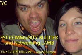
The interest for this years LAMMYs is still peaking and I appreciate seeing so many recent/new LAMBs getting out campaign banners and being active on twitter! Keep it up folks! Now over to the fun part some more banners!
Related Posts

#LAMMY2012 Winners and Runner-ups!
So finally this years LAMMYs are behind us. It has been both a fun and very hectic period. After the jump I give you all the winners and runner-ups with their vote tallies. BEST RATING SYSTEM Winner: Cinematic Paradox, 29 votes Runner-up: 3 guys 1 movie, 21 votes BEST BLOG…

#LAMMY2012 Winner – BEST BLOG
Its time for the big Tomato… Presented by The LAMB from Forgotten Films

#LAMMY2012 Winner – Best New LAMB
Ok everyone this video is overlong but I still think you’ll manage… =) Its extremely spoiler heavy so I’ll deactivate the comments for an hour or so… enough talking here it goes!


The B-Movies banner is a little hard to read, but if they’ve got the best cupcakes, I’m there.
Well if you click on it and make it bigger, it’s easier to read. I didn’t wanna make it look tacky by having the text background pure white.
-Jason