

If you’re new to this feature or need a refresher, click the label at the bottom of this post and see the previous posts. Otherwise, here are the basics:
What I do is list a site; you critique it. But here’s the catch: to induce the most honest reactions, don’t leave the comment using your normal alias/login – instead, go anonymous (for now you probably need to comment through bogus information and I’ll moderate all comments through), and be as brutally honest (or complimentary) as you wish to be. Also, be specific, and naturally, don’t be rude. If I deem anything inappropriate, I’ll have no problem deleting the comment.
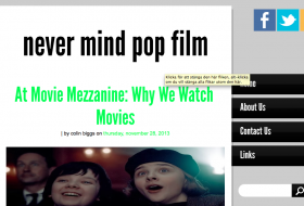
Site: Never Mind Pop Film
LAMB: #330
URL: http://nevermindpopfilm.blogspot.se


Don’t stretch photos, it just doesn’t look good. Resizing uncomfortable, but essential. It distracts from the (actually great) content.
I’m not actually sure how to change that inside the html, but I will definitely try to have that fixed.
Thanks!
I’d look over the settings for your design. It feels a bit clunky from time to time. One example is that when clicking the top banner you aren’t redirected to the front page. Stuff like that can be annoying to your readers.