


It’s Blusterin’ Time!
If you’re new to this feature or need a refresher, click the label at the bottom of this post and see the first few posts. Otherwise, here are the basics:
What I do is list a site; you critique it. But here’s the catch: to induce the most honest reactions, don’t leave the comment using your normal alias/login – instead, go anonymous, and be as brutally honest (or complimentary) as you wish to be. Also, be specific, and naturally, don’t be rude. If I deem anything inappropriate, I’ll have no problem deleting the comment.
So, go to the site listed below, familiarize yourself with it for a few minutes, then come back and leave some constructive criticism and/or comments that you have.
And remember: Blustering should be a two-way street; if you’ve asked to be blustered, you better be a blusterer.
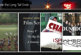
Site: Films from Beyond the Time Barrier
LAMB#: 965
URL: http://filmsfrombeyond.blogspot.com/

If you would like to have your blog blustered by fellow LAMBs, please send me an email containing your site’s info and “Bluster Me!” in the subject line.

wow, another blog I didn’t know existed, and yet so well presented. Personally, I don’t go a bundle on the movie poster background, and my personal preference says that I’ve always found those cloud links to be a bit overkill, but apart from that i cann’t fault it for layout or content. A blog made with love, I’d say.
Love the blog and the layout. It’s just me, but my focus goes for a toss when the post is super long. So maybe breaking them up if possible. All the best!
Design wise looks great. Love the Mar-Key feature. The only little things I would change is try and make the post header font and titles stand out more. and make the banner image more striking with a darker background color, something that looks more like an evening sky.
The content is well written, but the posts might just be a little long for my attention span.
I like your writing and your layout for the most part. Maybe add transparency to the Mar-key and other images you make to have them flow better within the site. For the background of the posters, use Paint.net or another program to make them slightly out of focus, because right now they make the site seem too busy. Oh, and have your links open up in a new window so I don’t have to keep navigating back to your page when I got to an external site.
But I like your writing and passion. Please keep it up!
If you’re going to keep the background you should make it a sticky, so it doesn’t roll with the page. Or make it continue it’s stupid that it just ends halfway.
Great abouts! Great variety with your reviews, they are on point an informative. Maybe you should try and post something else as well? Like a feature of some kind, just reviews can get a bit boring especially since your doing B-films, it’s very specific and I for example don’t have any kind of way to grasp it.
Hope you’re ready for the bluster, bucko, cuz I… really like your site.
I like the design, particularly how the black text on light blue makes your pieces really nice to read. I like the clarity of the navigation. I like how you’ve restricted your side column to the essentials. I like how (at a glance) you’ve maintained a pretty tight focus on the subject of your blog. I really like the “Mar-Key”s.
If there’s anything I don’t like, it’s that this blog makes me hate the look of mine a little bit more.
Nice work.