


It’s Blusterin’ Time!
If you’re new to this feature or need a refresher, click the label at the bottom of this post and see the previous posts. Otherwise, here are the basics:
What I do is list a site; you critique it. But here’s the catch: to induce the most honest reactions, don’t leave the comment using your normal alias/login – instead, go anonymous (for now you probably need to comment through bogus information and I’ll moderate all comments through), and be as brutally honest (or complimentary) as you wish to be. Also, be specific, and naturally, don’t be rude. If I deem anything inappropriate, I’ll have no problem deleting the comment.
Site: Journeys in Classic Films
LAMB#: 1267
URL: http://journeysinclassicfilm.com

And remember: Blustering should be a two-way street; if you’ve asked to be blustered, you better be a blusterer.
If you would like to have your blog blustered by fellow LAMBs, please send me an email containing your site’s info and “Bluster Me!” in the subject line.

The content is right up my street. As far as design goes, the screen width needs a slight reduction to get rid of the dreaded horizontal scroll. Also there’s far too much scrolling, there needs to be less posts per page, I’d suggest no more than five. That would get rid of all the empty space below the sidebar. I’m not a fan of using so many labels, I think the less you use the more effective they are. The color scheme is a bit bland, maybe a black and white scheme to match the content?
A good site overall, just a few design suggestions:
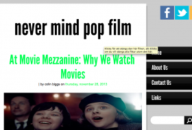
It’s redundant having the site title at the top when it’s already in the banner. I’d remove that, have the banner link to your homepage, then put the description below the banner, and also change/darken the color of the description text too.
You use an awful lot of tags. Perhaps they should be displayed at the bottom of the post instead of at the top, because everybody will just scroll past that brick wall anyhow.
I agree with first anon about the color scheme. It would be better if it matched your content, as well as the banner and background. Right now the main body clashes with everything else.
But I don’t have a problem with horizontal scrolling on my screen, your overall width is pretty standard for modern sites. Though maybe the sidebar could be reduced or condensed, there is a lot of unused space in most of the boxes.
Agree with the others, I’d get rid of the tags as it’s something nobody will read. And the double title is a bit too much. When opening the blog (together with the tags) there is no information at all on my screen of the writing). I’d also use a higher resolution picture of the woman that’s used in the banner…
The first sidebar the various bits (Lamb/Donate/NetworkedBlogs) should be aligned the same way. Also wondering if a Donate button would be of much use…
I agree with having the DONATE and PROUD TO BE A LAMB buttons aligned. I have a mild OCD when it comes to having things look straight. I’m also not a fan of DONATE buttons. In fact, I’d get rid of it altogether and have your facebook like box and twitter account alongside the LAMB button so everything is accessible in the same place.
I really like the background with the classic film stars but the blue toolbar doesn’t really match it. Either change the background ((I would advise against that) or change the toolbar background to black or white.
Negatives aside – I really like what you’re doing and your writing style. You’ve got a niche that you stick to and you write about it passionately. It’s just the visual look that needs an update, in my opinion.
I really enjoy following this blog regularly because the topics and the subject area is right up my street. But I do have some suggestions.
Often the reviews of films are too long. If I’ve seen the film, the blow by blow of what happens in the film wastes my time. If I haven’t, then it kind of defeats the purpose of my seeing it. A brief summary and then more analysis, background, review, etc. would be nice. And keeping it shorter keeps your readers’ attention for the whole post.
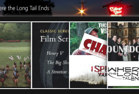
It would be nice to see more content “above the fold.” Right now, all you really see is the banner, so you automatically have to scroll (put in an effort) to reach the material your are looking for.
Some of the photoshop-type images, like of the “Old Hollywood Book Reviews” book and the “Golden Age of the Silver Screen” telly are kind of hokey. I’d rather see images of the actual book, or from the actual movies.
Overall, your blog is one of my favorites. Keep up the good work!
I would put the ads lower than your social media portion of the sidebar. The revenue really won’t take a hit shifting it downward.