

It’s Blusterin’ Time!
If you’re new to this feature or need a refresher, click the label at the bottom of this post and see the previous posts. Otherwise, here are the basics:
What I do is list a site; you critique it. But here’s the catch: to induce the most honest reactions, don’t leave the comment using your normal alias/login – instead, go anonymous (for now you probably need to comment through bogus information and I’ll moderate all comments through), and be as brutally honest (or complimentary) as you wish to be. Also, be specific, and naturally, don’t be rude. If I deem anything inappropriate, I’ll have no problem deleting the comment.
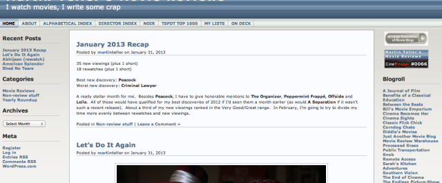
Site: Martin Teller’s Movie Reviews
LAMB#: 854
URL: http://martinteller.wordpress.com/

And remember: Blustering should be a two-way street; if you’ve asked to be blustered, you better be a blusterer.
If you would like to have your blog blustered by fellow LAMBs, please send me an email containing your site’s info and “Bluster Me!” in the subject line.

I think this is the kind of movie blog where you are supposed to find great knowledge and vast experience of movies instead of to have an entertaining reading in your spare time. That said, I think I have no problem with the plain, kinda boring appearance of this site (seriously, in a way, it looks like a wiki site). It has large content, but the writings are easy, short, and straight-forward. Even the author writes a review for every rewatch. Haha.
Maybe it’s better to put the blogroll and search box in the left sidebar and clear up the right sidebar (or you could put some ads there). With a very large contents it has, it’s better to give an easier navigation to the previous posts (add more posts in the “recent posts” section, add “popular posts” section, or tag clouds could help; the vertical upper menubar is nice).
I like plain and boring! I try to keep the design very, very simple… I don’t like cluttered, flashy blogs.
I don’t want any ads. I’m not sure there’s any benefit to clearing up the right sidebar (and I don’t think the WordPress template would allow me to just get rid of it, widening the main part of the blog).
I love your idea of more posts in the “recent posts” section, I don’t know why I never thought of doing it before. I implemented that immediately.
Popular posts wouldn’t make much sense on my site, which only averages about 200 hits per day. The most popular posts are the indices. Tag clouds would mean I have to tag all my posts… and I just don’t have the strength or patience! I started out tagging my posts, but I found it pretty tedious. Maybe some time in the future.
Thank you for the comments and suggestions!
Nice post. Looks great.
Thank you!
Thanks!
I couldn’t figure out how to go anonymous on this new commenting system, but I’m willing to stand by all my notes, so here goes:
I really like the multiple indexes you have — by name, director and year. With the number of films you’ve reviewed this is absolutely essential. The one recommendation I would make is that you might move the search box above the blogroll, instead of below it. (It may just be the size on my screen, but the search box currently almost goes off the bottom of the screen, which isn’t a place I’d normally look for it.)
And I really like the “On Deck” feature. It’s an idea that I think a lot of us might benefit from borrowing.
It’s amazing how many films you review. It looks like it’s often two a day, and I like the length of your reviews. It makes it very reader-friendly. I also liked that you included an IMDB link at the end of reach review. Sure, it’s easy enough for someone to type in the title, but having the link makes it just a little bit easier for readers to go into more depth.
I also enjoyed that you do re-watch reviews, since so often our perspectives can change. One suggestion that you might consider is to link the re-watches together. In other words, when you are reviewing something for the third time, include a link to your first and second review as well, so that people can easily go back and see how your perspectives have changed.
Thanks so much! I took your advice about the search box.
I’ve often thought about linking to previous reviews… I really should, despite the extra hassle. Of course, sometimes I’m not happy with those older reviews! But I’ll give it some more consideration.
Have taken a look at the blog and as noted before it’s a very basic look (which you state you like), but I think it does make it less inviting for first time visitors. It’s clear from the reviews that you have your own niche (not the big blockbusters and newest movie), which is a good thing.
Looking at your recap it might be a good idea to include a link to the movies you mention. I read it and was wondering about Peacock, but couldn’t click through to read your review.
Quickly browsing through the posts I don’t see many comments. It might be a good idea to stimulate interaction a bit more by asking questions.
I see what you’re saying about some people not finding the blog inviting. I guess it’s just a different in design philosophy. I cringe when I go to a site that’s too flashy and busy (tbh, I find the LAMB design a bit cluttered, though it’s better than it used to be). The sites I find inviting are easy on the eyes, simple to navigate, quick to load. I have spend hours poring over the WordPress templates and the one I use is a little dull but it’s the only one that met my needs. But, I may take a second look with a redesign in mind.
Good idea about linking the reviews in the monthly recaps. I’ve thought about it but didn’t take the initiative. I’ll rectify that.
Getting comments is definitely my weak spot. I’ve tried commenting on other blogs but it rarely seems to get reciprocated. I’m not sure how I would integrate asking questions with my writing style, but it’s worth some thought.
Thank you for your valuable input!
Martin, as you probably know, I’m like you in my preferences of blog design. I want it clean and simple and I find stuff that moves around very annoying and distracting. So thumbs up from me!
If there’s anything I would wish for, it’s for you to step out once in a while from the review genre. I would love to see some more opinionated pieces where you share your thoughts about something connected to the world of cinema. Be personal! Let out your sadness, frustration, enthusiasm, crazy ideas… whatever! I know that kind of writing isn’t for everyone, but if’s for you, I think it can make your blog a little bit more inviting to interaction and discussion.
Apart from that: keep up the good work! I’m so glad you took the step from your old website to the blog format, even if it meant a lot of extra work for you.
I have done a few non-review essays, and you’re right, they do tend to generate more response. I just haven’t been inspired with a topic for one lately. It should probably come naturally rather than trying to force it. Or maybe forcing it is okay, too. I’ll keep it in mind.
Thanks, Jessica!
Your header with the white stripes behind it is uuuuugly. Otherwise, I’ve always enjoyed your reviews. Thanks.
I can’t argue with that, I’m not fond of the header at all. Unfortunately, it comes with the WP template and I don’t think I can customize it without paying for premium membership.
Thanks!
I am eagerly waiting for the man of steel. But I can’t count on it seeing the trailers. Superman returns was also having good trailer but the movie failed to fulfill its promise.
Content is solid, informative and well written. Also serious kudos on the posting pace that you keep up. That all being said, the layout of the site is flat out bad. It isn’t clean at all, it’s noisy and distracting. It also doesn’t help that it is badly outdated, which gives it a heavy amateurish feel and will always be something you are working against until it improves.the layout will have better flow.
Also not a huge fan of three column layouts. Just too much junk on the screen. If you want a clean and simple look go two column and put your content on the left (which is where Western cultures start reading from) and put the misc links and other stuff in the right column. Even if you have just as much stuff up as you do now it will feel to the reader as less cluttered and the layout will have better flow.
Lastly, trim back the number of articles you post. Your content is long and solid so people are stuck scrolling too much. You could probably get away with just three posts per page and the site would feel far less daunting.