

It’s Blusterin’ Time!
If you’re new to this feature or need a refresher, click the label at the bottom of this post and see the previous posts. Otherwise, here are the basics:
What I do is list a site; you critique it. But here’s the catch: to induce the most honest reactions, don’t leave the comment using your normal alias/login – instead, go anonymous, and be as brutally honest (or complimentary) as you wish to be. Also, be specific, and naturally, don’t be rude. If I deem anything inappropriate, I’ll have no problem deleting the comment.
Site: Duke and the Movies
LAMB#: 843
URL: http://dukeandthemovies.com/

And remember: Blustering should be a two-way street; if you’ve asked to be blustered, you better be a blusterer.
If you would like to have your blog blustered by fellow LAMBs, please send me an email containing your site’s info and “Bluster Me!” in the subject line.

I think you could use your sidebar differently. A lot of the stuff that are really far down I’d put higher up.
OK, first of all: I think your blog looks great! I also dig your writing.
I can only come up with a couple of minor quibbles.
1. I would prefer if you could see the number of comments a post has already on your frontpage. As a commenter I like to see if there have been more comments since last time I read it. I like to read well commented on posts. By giving the numbers you help out the readers to taka a decision to click through.
2. I would prefer if you set your feed so that you could read the entire post if you’re reading it through a feed-reader, which I do. Now you only give a few lines and then you force the reader to open up your entire blog, a process which takes time and effort. Just give the entire post right away in the feed.
I know it won’t give you as many clicks, but does that really matter so much?
Needs more cowbell.
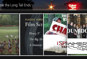
The featured content drop-down thing on the homepage widget seems unnecessary. Also, it’s odd to have that text there. The summary of the posts are also way too long and given how fast it moves to the next one, you can’t even read it anyway.
Also, that PayPal button stands out like a sour thumb. That bright yellow just doesn’t fit with the visual look of the site. Perhaps if you made it fit more with the look of your site, if that’s something you can control.
The Love Film widget also stands out a bit as well, is there a way you can change the white background to maybe be the same color as the background behind the post previews? I know some widgets will let you change the background color if you know the right code.
You’re blogroll is super long, as is your archive. Honestly, I think very few, if any visitors will use the archives, so I’d get rid of that. The blogroll you might consider making another page…or maybe not. Some people want it on their sidebar to give my exposure to their friend’s sites. It’s just about twice as long as most. Maybe you could cut some…especially sites like Mubi and Reel Views which most film buffs probably already know about.
First off, thank you all for the comments.
Now let me address you good folks one at a time:
First commenter: not very descriptive, but I must say that my reviews of “What’s In Theaters” is far more important than “blogathons” – which I scarcely partake in. I suppose the “List” section could be higher up, but it will suffice.
Second commenter: I really like your first suggestion and will be asking my web designer to look into it. As for the feed. The reason I cut them short, is not because of views – it’s because if I didn’t, the archives would contain the whole, entire post – and looks incredibly silly. There may be a way to alter that, but it’s not likely.
Third commenter: Whoever you are, I appreciate the field day you had with my site. Your rejection of the revolving featured content is odd – and your reasoning is even more perplexing. I can shorten the amount written, but it’s usually not too much (also it changes every 10 seconds, which gives most people time to read one-two sentences).
I agree with you about the paypal button. Love to change the color of that to blue or something – as for LoveFilm … it’s only black/white/red background.
As for the archive. Yes, it’s long. But when you apply for job positions/organizations/etc, they like to see how much you’ve done, and how long you’ve been doing it. I could cut down on the blogroll. But I’m big on film community. Perhaps I could take out a few of the professional sites. Overall, great points (whoever you are).
I may be using it wrong, but in the subscribe section it says “sign up to receive latest news”, but when I entered my email address the next page tells me “The feed does not have subscriptions by email enabled.”
I’ll look into it.
I wish your site had a “subscribe to comments” feature. It would make it easier to participate in any ongoing discussions.
I would fix the slider so it allows you to click the text area. That’s generally how sliders work so I actually thought yours was faulty at first. Otherwise nice site.
The sidebar has coordination issues with color and sizing. Everything else, including content, is solid