


It’s Blusterin’ Time!
If you’re new to this feature or need a refresher, click the label at the bottom of this post and see the previous posts. Otherwise, here are the basics:
What I do is list a site; you critique it. But here’s the catch: to induce the most honest reactions, don’t leave the comment using your normal alias/login – instead, go anonymous, and be as brutally honest (or complimentary) as you wish to be. Also, be specific, and naturally, don’t be rude. If I deem anything inappropriate, I’ll have no problem deleting the comment.
Site: The Vern’s Videovangaurd
LAMB#: 1222
URL: http://www.videovangaurd.com/

And remember: Blustering should be a two-way street; if you’ve asked to be blustered, you better be a blusterer.
If you would like to have your blog blustered by fellow LAMBs, please send me an email containing your site’s info and “Bluster Me!” in the subject line.

Okay:
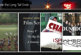
– Your main image (the reel) is off center and HUGE. Shrink it and have it fit the main box. As it is now, when the page loads up, that’s mostly what readers will see. Kind of annoying.
– Your top menu is unweildly. Shrink the names and remove some of the categories that aren’t being used and try and make it a single line. Like: Home | Reviews A-F | G-Z | Follow | Advertise. Less is more up top.
– You don’t have to credit the studios on every picture. They don’t care.
– Your sidebars are in a confusing order. Put all of your ‘Follow Me’ things in the same place, and put your ‘Recent Posts’ listing near the top right– that’s where people will look to see if they’ve missed anything new.
– You have a weird sense of spacing for a lot of your articles. Mess with the HTML to give it a more casual look, because right now it looks like things were just plopped into place.
– Don’t put your recommendations before the links to all of your content. People are at *your* site to read *your* stuff. Having all the other blog links show up first seems to indicate that you haven’t done much.
Hope this helps!
Thank you very much for all your comments and help.
Two things that I personally would change are:
– There are too many advertisements on the front page for my tastes. Unless they are really pulling in the big bucks or the extra hits, consider limiting them to the top moneymakers.
– I personally don’t like that I have to jump (click) to read the whole article, but if you are going to keep it, try to make sure that there is something that will catch my attention in the first paragraph that is on the front page. You have a lot of disclaimers and basic credits, but I’d be more likely to continue clicking through if I got a taste of your actual writing–perhaps even with a cliff hanger that makes me want to see what you say next.
Besides that, I’d just say to keep up the great work!
Shorten your menu items so that the entire menu fits on one line.
Try to expand your header image to fill the entire width of your blog, and maybe crop out some of the extra rows of seats at the bottom so that the aspect ratio is less of a square.
I have mild colorblindness and find the red links in the sidebars difficult to distinguish from the red background.
What anon #1 said about the spacing. It looks wonky, particularly at the top of each post.
For your covers and screenshots, save them to disk and upload them to your own account. It is poor etiquette to hotlink images from other sites, and it leaves you vulnerable if they decide for whatever reason to remove the image or switch it to midget porn…