

What I do is list a site; you critique it. But here’s the catch: to induce the most honest reactions, don’t leave the comment using your normal alias/login – instead, go anonymous, and be as brutally honest (or complimentary) as you wish to be. Also, be specific, and naturally, don’t be rude. If I deem anything inappropriate, I’ll have no problem deleting the comment.
Site: Mettel Ray Movie Blog
LAMB#: #1168
URL: http://mettelray.wordpress.com/

And remember: Blustering should be a two-way street; if you’ve asked to be blustered, you better be a blusterer.
If you would like to have your blog blustered by fellow LAMBs, please send me an email containing your site’s info and “Bluster Me!” in the subject line.
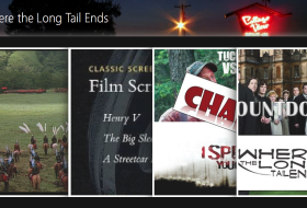

It’s visually very boring. There’s so much empty white space that I kind of lost track where the posts are separated. The link column on the right side is far wider than it needs to be. Increasing that width would allow you to provide a bigger preview of your blog post without clustering it up vertically.
A few minor tweaks could improve the visual appeal of your site a lot. I agree that there is too much empty white space. (The opposite is more usually the problem.) I suggest:
1. Reduce the overall width of the white area.
2. A real color for the borders instead of black would be more appealing.
3. Reduce the proportion of the sidebar to the main area–not more than 1/3 as wide. The “buttons” in the sidebar are great but seem dwarfed by all that white space.
4. Move those couple of non-post items at the bottom of the main area to the bottom of the sidebar.
5. Your blog title is too small compared to the description and I don’t like it in that small round button. It needs to stand out more so that it is the first thing people notice. I like the description below it, but making the dots separating the parts different colors is distracting. Choose one color you like and stick with it.
6. Using both vertical and horizontal separator lines seems too much. I’d choose one or the other and also change the color from gray–something to complement a new color for the outer background.
A couple of further thoughts about what I wrote above:
#3–I meant make the sidebar not more than 1/3 the total width of the blog, or 1/2 the size of the area the posts appear in.
#6–On reflection, I’d eliminate the vertical separator. The buttons in the sidebar are distinct enough that they’re already set off from the post area.
Oh guys.. All well thought of ideas! Sidebar size is the biggest problem but you see, I’m .wordpress, I can’t tweak my blog size and fonts etc…. 🙁
I’ll think about the color.. But what about content?
I’d suggest trying out different free themes to see which ones fit your graphics better, I’m sure there’s one somewhere that will work better than the one you have. I believe there’s an option to preview the theme without actually switching over to it completely, but I haven’t tried it myself.
Yeah, there is. Hours of trying and fitting and I feel like this is the best one out of all. The banner is the biggest (I’m only interested in white themes) and the sidebar thing doesn’t alter the images. Just have to wait patiently and if the right day comes, buy my own mettelray.com rights. (:
I actually think your content is very good. Your reviews are reflective and not just summaries. I love your review of Hanna and the fact that you had a post-script containing some pertinent facts that I didn’t know. I’d recommend running your posts through a grammar-check program. There are some things that spell check misses that could be easily fixed. Just copy and paste your text into a word-processing program and you’ll know what to fix. The column width is a big issue, it’s especially noticeable when you click the “load more posts” button because you have nothing on the right side but white space when you scroll down. I actually like your logo, I’d like to see it pasted into the middle of some sort of montage though. That way you could keep the logo and have a banner. Just a thought.
I will definitely change the banner and I will try to find ways to make it not go to infinity but rather page 2 and so on but it seems like this theme doesn’t have this option.
Definitely gonna check for more grammar, although I have an online program that does it for me but I guess there are things it misses.
Does wordpress.com allow you to add custom CSS?
If so, then you can add some rules to adjust the widths and fonts.
Message me in the forums and I can help you with that.
WordPress only allows changes in the CSS when you purchase the custom design thing. I don’t really like that option at the moment, meaning, I can’t really change the outlook without changing the theme and that could just go even worse because I like the theme.
Thank you all for great tips! I’ve done some changes, as much as WordPress lets me and now I have a new theme. Regarding it being boring with no color, it is a matter of taste, I prefer a clean look so that will stay. But hopefully the sidebar is not too close to the text now, it doesn’t let me change it .. but.. I like it.
Brutal was not brutal at all it seems. (: