


It’s Blusterin’ Time!
If you’re new to this feature or need a refresher, click the label at the bottom of this post and see the previous posts. Otherwise, here are the basics:
What I do is list a site; you critique it. But here’s the catch: to induce the most honest reactions, don’t leave the comment using your normal alias/login – instead, go anonymous, and be as brutally honest (or complimentary) as you wish to be. Also, be specific, and naturally, don’t be rude. If I deem anything inappropriate, I’ll have no problem deleting the comment.
Site: At the Back
LAMB#: 1222
URL: http://attheback.blogspot.se/

And remember: Blustering should be a two-way street; if you’ve asked to be blustered, you better be a blusterer.
If you would like to have your blog blustered by fellow LAMBs, please send me an email containing your site’s info and “Bluster Me!” in the subject line.

Your content is really really good. You have a deep catalog of reviews. Which is amazing.
I would just say add a little bit of character to the site. Maybe something in the banner.
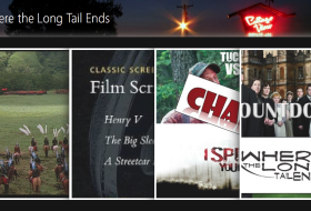
My immediate (first impression) was that this was a site to review classic films. Which, is not the case. You have everything from Chaplin to The Dark Knight Rises.
I see you got an award for it, but you definitely are one of the most versatile blogs I’ve seen. So, maybe play that up somehow.
Thanks for your critique. It does look like a classic film blog at the moment as I’m watching a lot of Chaplin recently. I do try to be as diverse as possible.
As for character, it’s something I really want to do but have no skills. A graphic designer friend is currently designing something for me though. Thanks again.
I enjoy your content (I strongly disagree with your 5/10 for Aguirre, but to each his own!). Should I assume by the .se domain that English is not your first language? The writing feels a little stiff in places, but anyone could say the same thing about me.
Nice clean design. The “You might also like” links are an interesting idea, but they kind of clutter up the main page. It seems like they should only be at the bottom of each post. Also, they often seem to link to completely unrelated posts. Is that an automatic widget, or do you pick the links?
I like your blog.
Being English, English is my first and only language. I hope it was only the .se (a LAMB thing) and not my writing that gave you that idea!!
As for the ‘You Might Also Like’ widget, it is meant to scan the words and match a post to similar ones but rarely works. I’ll look into altering it. Having said that I do find it can draw people’s attention to other posts which they might not have otherwise discovered. Thanks for your comments!
I think something as simple as changing the color scheme and using a new font for your header would go a long way.
Also, with as many reviews as you’ve got you may consider adding an index page. Something sortable or just alphabetical if you want.
Thanks, I like that index idea. I’ll look into doing something about that.
Along the lines of what others are saying, I would definitely lay out what your site is meant to do. “At the Back” doesn’t really give anyone a sense that it’s a movie site, let alone what you review. It can be as simple as a line or two. at the top of the blog or top of the sidebar.
There’s something screwy with the block quote at the top of your reviews. It’s small and unreadable (at least on my screen).
Agree with the “You Might Also Like” comments. There so random as to be pretty useless.
I would look at minimizing the sidebar widgets. That just seems busy and random. I also like seeing search bars in a more prominent place.
Nice clean design which I definitely appreciate!
Generally, I’m not a fan of the pink. It gives it a girly look and there’s nothing wrong with girly it’s just.. I don’t know, pink doesn’t scream serious to me.
Yet again a personal opinion: reviews starting with the plot summary don’t catch my attention. I guess it works but I usually go for the personal opinion in the first paragraph and then later on the plot etc. Personality is what catches readers a lot in movie blogs because you have SO many bloggers and so many of them review the same movies, so you have to have that “wow” or “yeah” in the beginning so that people would click read more. Especially when you aren’t a specific blogger but a general wall to wall type of reviewer. Does this make sense?
Definitely need a header..about page would be nice – makes it more personal because we do care who you are and what you’re all about.
Right sidebar.. needs cleaning up. I suggest pages, and more images on the right. Using directors pictures with the name that clicks into their tag is more appealing than having the name. Plus, you said you’re not much of a graphic designer, boy, get used to it – get that program out and start practicing because that is something that every blogger has to know at least a little.
I thoroughly enjoy reading your reviews and can say that they have made me watch films that I did not know about. The variety is excellent and they are very well written.
I’m a fan of the content of the site but visually I find it unappealing which is why I subscribe to the posts in google reader rather than reading them on the site. Black text on white/grey background or grey text on black background is all my eyes can take.
Thanks to everyone for the comments. I’ve taken a lot of it onboard and will be making some changes over the next few weeks. This has been a very useful exercise, cheers.